Let me talk about the new Deezer logo
I like design, and I wish I knew more about it. But, I'm not a designer.
Having said that, I don't know how fair it would be for me to talk about Deezer and their new brand identity, officially announced on November 7th — even knowing that I felt like talking about it, anyway.
Some background
I understand that Deezer is not as popular as Spotify or Apple Music. They are a French digital music platform founded in 2007, available in at least 180 countries and offering 120+ HiFi music tracks. But, the thing is, although they had 9.4 million subscribers and a revenue of € 450 million back in December, 2022, they most likely don't have the same brand recognition their competitors have.
By the time Deezer was released here in Brazil, back in 2013, I was a Spotify user, mostly because me, too, wanted to try the novelty of a digital music platform having only experienced MP3 downloads to that point, and because I lacked other options — I remember using a VPN to signup for Spotify, as they weren't available in Brazil until 2014 (me, pausing the writing, to notice that, OMG, Deezer came to Brazil before Spotify, even though Spotify launched in 2006, one year before Deezer).
The next year, 2014, Deezer made a partnership with TIM, which is, to this date, my mobile carrier of choice. From the moment their partnership started, I could listen to as much music as I wanted using my 3G, later 4G, later 5G, without being charged for any traffic and without having to pay for a separate subscription. That, together with Deezer Flow, an intelligent, AI-powered, algorithm able to provide me with better suggestions of music I would love to hear the more music I listened to, closed the deal for me. I chose Deezer and I never looked back (and, along with some other Deezer adopter friends, had unnumbered discussions about Flow and its undeniable powers that almost led to friendship ends).
Deezer visuals
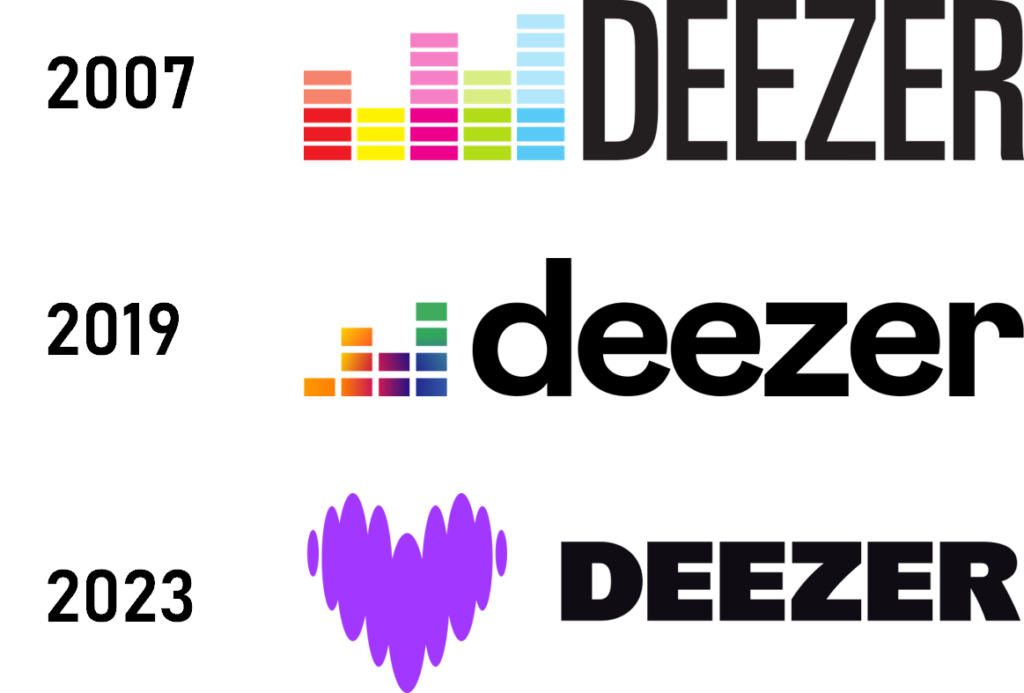
Having said all that, I never thought Deezer visuals was a winner. I mean, look at the image I created by stitching together their logos, all taken from Wikipedia for reference. Their logo, for a start, has always been horrible, at least in my humble opinion. But, you know, there are those services that you keep using despite of their visual design because they exceed in their offer, and that's fine.
Past 2019, I even learned to like their new logo. Got used to it.
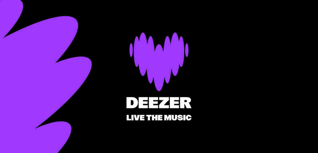
So this week, when the totally unaware me saw a totally different logo on my iPhone's home screen, I thought... what?? The colorful equalizer had gone, replaced by a heart. A purple. Heart. I didn't understand until I read their press release:
Paris, November 7th, 2023 – Deezer (Paris Euronext: DEEZR) is reinventing itself as an experience services platform, with expression and connection as guiding principles to help artists, fans and partners to be and belong through music. To highlight the transformation and recharge people’s emotional connection to the brand, Deezer is refreshing its visual identity.
So their heart is here to express this new experiences and belonging feelings. Understood. But this didn't rid me of the immediate feeling I had: it really looked to me, at first site, that tapping that new icon would open a dating app (apparently, I'm not alone in this sensation). But with design, I'm learning there's always a reason, and Deezer's press release explaining the sense, I started imagining an animated version of the logo, pumping to the different beats of some music. Until I saw that Koto Studio, responsible for the brand redesign and Deezer's new design system, had thought about the same:
Moving on, there's their new font. Named Deezer Sans, again according to Koto Studio, it is “a variable font designed in close collaboration with the NaN type foundry”, which uses forms “directly inspired by the shapes within the logo”. The way I personally understood it is that some curves and shapes of the letters came from the beating heart logo. I believe that would be a cool thing to do, if I was a designer.
I saw people mentioning that this new font looked like the font used in Fortnite. I don't know about that, so I asked my younger son, who's played his share of the game, just to understand, from him, that there's no similarity. Besides, with variable font weights and combined with different applications, I really liked the results, although I don't think I would apply the font to any project of mine...
Finally, Deezer has come from a colorful logo to adopting a single color for its services and interfaces: purple.
I understood that they want their users to start associating purple to the brand, the same way one associates Netflix with red, Crunchyroll with orange and Spotify with green. Although I liked the move, because I do believe that, with time, people will indeed start making this association, I guess I'll be missing the colorful mix that was present in their logo and interface so far. In a sense, I believe the multiple colors helped demonstrate a mix of styles, of rhythms, of different people... I don't know. I'll just miss it.
I guess that's it. I really felt like speaking about this Deezer move. To be perfectly honest, my first impulse was to criticize it, but that was just because I hadn't had the time to stop and understand the change.
I guess that, as it happens with so many human areas of work, it's easier criticizing someone's work is easier than stopping to breath and understand before speaking your mind. I'm glad I could do it, so what I ended up doing (or, at least, tried to do) was to pay some tribute to the change, even if maybe my opinion.
I really hope this new Deezer interface thrives, and I wish it is long lived.